目录
一、说明
二、函数和参数详解
2.1 scatter函数原型
2.2 参数详解
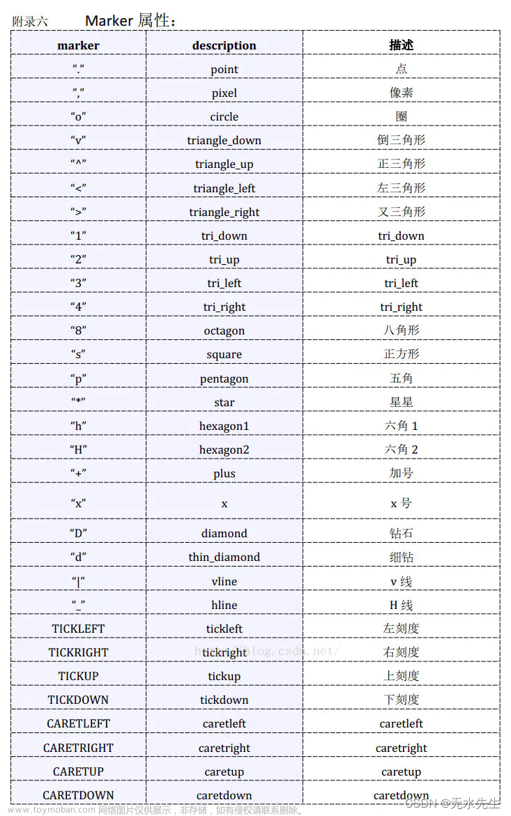
2.3 其中散点的形状参数marker如下:
2.4 其中颜色参数c如下:
三、画图示例
3.1 关于坐标x,y和s,c
3.2 多元高斯的情况
3.3 绘制例子
3.4 绘图例3
3.5 同心绘制
3.6 有标签绘制
3.7 直线划分
3.8 曲线划分
一、说明
关于matplotlib的scatter函数有许多活动参数,如果不专门注解,是无法掌握精髓的,本文专门针对scatter的参数和调用说起,并配有若干案例。
二、函数和参数详解
2.1 scatter函数原型
matplotlib.pyplot.scatter(x, y, s=None, c=None, marker=None, cmap=None, norm=None, vmin=None, vmax=None, alpha=None, linewidths=None, *, edgecolors=None, plotnonfinite=False, data=None, **kwargs)
2.2 参数详解
| 属性 | 参数 | 意义 |
| 坐标 | x,y | 输入点列的数组,长度都是size |
| 点大小 | s | 点的直径数组,默认直径20,长度最大size |
| 点颜色 | c | 点的颜色,默认蓝色 'b',也可以是个 RGB 或 RGBA 二维行数组。 |
| 点形状 | marker | 点的样式,默认小圆圈 'o'。 |
| 调色板 | cmap | Colormap,默认 None,标量或者是一个 colormap 的名字,只有 c 是一个浮点数数组时才使用。如果没有申明就是 image.cmap。 |
| 亮度(1) | norm | Normalize,默认 None,数据亮度在 0-1 之间,只有 c 是一个浮点数的数组的时才使用。 |
| 亮度(2) | vmin,vmax | 亮度设置,在 norm 参数存在时会忽略。 |
| 透明度 | alpha | 透明度设置,0-1 之间,默认 None,即不透明 |
| 线 | linewidths | 标记点的长度 |
| 颜色 | edgecolors |
颜色或颜色序列,默认为 'face',可选值有 'face', 'none', None。 |
| plotnonfinite |
布尔值,设置是否使用非限定的 c ( inf, -inf 或 nan) 绘制点。 | |
| **kwargs |
其他参数。 |
2.3 其中散点的形状参数marker如下:
2.4 其中颜色参数c如下:

三、画图示例
3.1 关于坐标x,y和s,c
import numpy as np
import matplotlib.pyplot as plt

# Fixing random state for reproducibility
np.random.seed(19680801)


N = 50
x = np.random.rand(N)
y = np.random.rand(N)
colors = np.random.rand(N)          # 颜色可以随机
area = (30 * np.random.rand(N))**2  # 点的宽度30,半径15

plt.scatter(x, y, s=area, c=colors, alpha=0.5)
plt.show()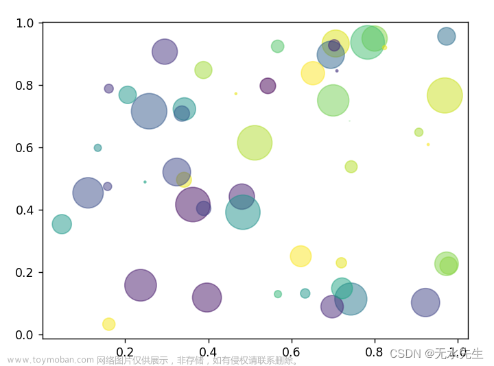
注意:以上核心语句是:
plt.scatter(x, y, s=area, c=colors, alpha=0.5, marker=",")
其中:x,y,s,c维度一样就能成。
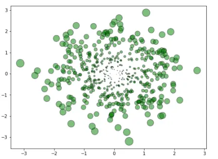
3.2 多元高斯的情况
import numpy as np
import matplotlib.pyplot as plt
fig=plt.figure(figsize=(8,6))
#Generating a Gaussion dataset:
#creating random vectors from the multivariate normal distribution
#given mean and covariance
mu_vec1=np.array([0,0])
cov_mat1=np.array([[1,0],[0,1]])
X=np.random.multivariate_normal(mu_vec1,cov_mat1,500)
R=X**2
R_sum=R.sum(axis=1)
plt.scatter(X[:,0],X[:,1],color='green',marker='o', =32.*R_sum,edgecolor='black',alpha=0.5)
plt.show()
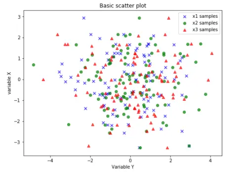
3.3 绘制例子
from matplotlib import pyplot as plt
import numpy as np
# Generating a Gaussion dTset:
#Creating random vectors from the multivaritate normal distribution
#givem mean and covariance
mu_vecl = np.array([0, 0])
cov_matl = np.array([[2,0],[0,2]])
x1_samples = np.random.multivariate_normal(mu_vecl, cov_matl,100)
x2_samples = np.random.multivariate_normal(mu_vecl+0.2, cov_matl +0.2, 100)
x3_samples = np.random.multivariate_normal(mu_vecl+0.4, cov_matl +0.4, 100)
plt.figure(figsize = (8, 6))
plt.scatter(x1_samples[:,0], x1_samples[:, 1], marker='x',
color = 'blue', alpha=0.7, label = 'x1 samples')
plt.scatter(x2_samples[:,0], x1_samples[:,1], marker='o',
color ='green', alpha=0.7, label = 'x2 samples')
plt.scatter(x3_samples[:,0], x1_samples[:,1], marker='^',
color ='red', alpha=0.7, label = 'x3 samples')
plt.title('Basic scatter plot')
plt.ylabel('variable X')
plt.xlabel('Variable Y')
plt.legend(loc = 'upper right')
plt.show()
import matplotlib.pyplot as plt
fig,ax = plt.subplots()
ax.plot([0],[0], marker="o", markersize=10)
ax.plot([0.07,0.93],[0,0], linewidth=10)
ax.scatter([1],[0], s=100)
ax.plot([0],[1], marker="o", markersize=22)
ax.plot([0.14,0.86],[1,1], linewidth=22)
ax.scatter([1],[1], s=22**2)
plt.show()

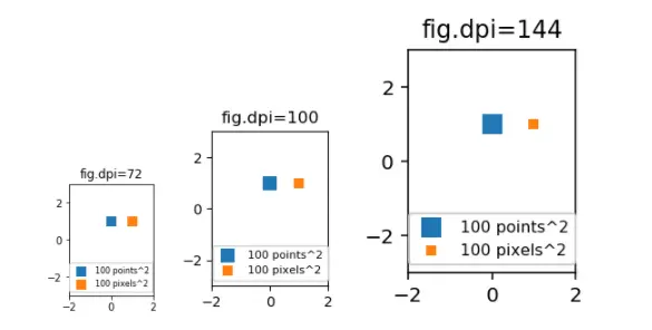
import matplotlib.pyplot as plt

for dpi in [72,100,144]:

    fig,ax = plt.subplots(figsize=(1.5,2), dpi=dpi)
    ax.set_title("fig.dpi={}".format(dpi))

    ax.set_ylim(-3,3)
    ax.set_xlim(-2,2)

    ax.scatter([0],[1], s=10**2,
               marker="s", linewidth=0, label="100 points^2")
    ax.scatter([1],[1], s=(10*72./fig.dpi)**2,
               marker="s", linewidth=0, label="100 pixels^2")

    ax.legend(loc=8,framealpha=1, fontsize=8)

    fig.savefig("fig{}.png".format(dpi), bbox_inches="tight")

plt.show()
3.4 绘图例3
import matplotlib.pyplot as plt
for dpi in [72,100,144]:
fig,ax = plt.subplots(figsize=(1.5,2), dpi=dpi)
ax.set_title("fig.dpi={}".format(dpi))
ax.set_ylim(-3,3)
ax.set_xlim(-2,2)
ax.scatter([0],[1], s=10**2,
marker="s", linewidth=0, label="100 points^2")
ax.scatter([1],[1], s=(10*72./fig.dpi)**2,
marker="s", linewidth=0, label="100 pixels^2")
ax.legend(loc=8,framealpha=1, fontsize=8)
fig.savefig("fig{}.png".format(dpi), bbox_inches="tight")
plt.show()
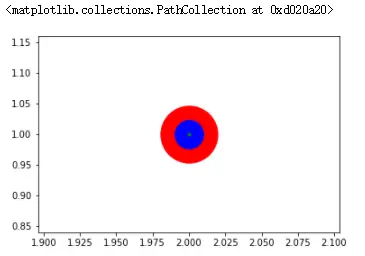
3.5 同心绘制
plt.scatter(2, 1, s=4000, c='r')
plt.scatter(2, 1, s=1000 ,c='b')
plt.scatter(2, 1, s=10, c='g')
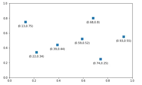
3.6 有标签绘制
import matplotlib.pyplot as plt

x_coords = [0.13, 0.22, 0.39, 0.59, 0.68, 0.74,0.93]
y_coords = [0.75, 0.34, 0.44, 0.52, 0.80, 0.25,0.55]

fig = plt.figure(figsize = (8,5))

plt.scatter(x_coords, y_coords, marker = 's', s = 50)
for x, y in zip(x_coords, y_coords):
    plt.annotate('(%s,%s)'%(x,y), xy=(x,y),xytext = (0, -10), textcoords = 'offset points',ha = 'center', va = 'top')
plt.xlim([0,1])
plt.ylim([0,1])
plt.show()
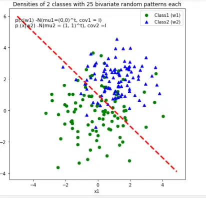
3.7 直线划分
# 2-category classfication with random 2D-sample data
# from a multivariate normal distribution

import numpy as np
from matplotlib import pyplot as plt

def decision_boundary(x_1):
    """Calculates the x_2 value for plotting the decision boundary."""
#    return 4 - np.sqrt(-x_1**2 + 4*x_1 + 6 + np.log(16))
    return -x_1 + 1

# Generating a gaussion dataset:
# creating random vectors from the multivariate normal distribution
# given mean and covariance

mu_vec1 = np.array([0,0])
cov_mat1 = np.array([[2,0],[0,2]])
x1_samples = np.random.multivariate_normal(mu_vec1, cov_mat1,100)
mu_vec1 = mu_vec1.reshape(1,2).T # TO 1-COL VECTOR

mu_vec2 = np.array([1,2])
cov_mat2 = np.array([[1,0],[0,1]])
x2_samples = np.random.multivariate_normal(mu_vec2, cov_mat2, 100)
mu_vec2 = mu_vec2.reshape(1,2).T # to 2-col vector

# Main scatter plot and plot annotation

f, ax = plt.subplots(figsize = (7, 7))
ax.scatter(x1_samples[:, 0], x1_samples[:,1], marker = 'o',color = 'green', s=40)
ax.scatter(x2_samples[:, 0], x2_samples[:,1], marker = '^',color = 'blue', s =40)
plt.legend(['Class1 (w1)', 'Class2 (w2)'], loc = 'upper right')
plt.title('Densities of 2 classes with 25 bivariate random patterns each')
plt.ylabel('x2')
plt.xlabel('x1')
ftext = 'p(x|w1) -N(mu1=(0,0)^t, cov1 = I)\np.(x|w2) -N(mu2 = (1, 1)^t), cov2 =I'
plt.figtext(.15,.8, ftext, fontsize = 11, ha ='left')

#Adding decision boundary to plot

x_1 = np.arange(-5, 5, 0.1)
bound = decision_boundary(x_1)
plt.plot(x_1, bound, 'r--', lw = 3)

x_vec = np.linspace(*ax.get_xlim())
x_1 = np.arange(0, 100, 0.05)

plt.show()
 文章来源:https://www.toymoban.com/news/detail-490419.html
3.8 曲线划分
# 2-category classfication with random 2D-sample data
# from a multivariate normal distribution

import numpy as np
from matplotlib import pyplot as plt

def decision_boundary(x_1):
    """Calculates the x_2 value for plotting the decision boundary."""
    return 4 - np.sqrt(-x_1**2 + 4*x_1 + 6 + np.log(16))

# Generating a gaussion dataset:
# creating random vectors from the multivariate normal distribution
# given mean and covariance

mu_vec1 = np.array([0,0])
cov_mat1 = np.array([[2,0],[0,2]])
x1_samples = np.random.multivariate_normal(mu_vec1, cov_mat1,100)
mu_vec1 = mu_vec1.reshape(1,2).T # TO 1-COL VECTOR

mu_vec2 = np.array([1,2])
cov_mat2 = np.array([[1,0],[0,1]])
x2_samples = np.random.multivariate_normal(mu_vec2, cov_mat2, 100)
mu_vec2 = mu_vec2.reshape(1,2).T # to 2-col vector

# Main scatter plot and plot annotation

f, ax = plt.subplots(figsize = (7, 7))
ax.scatter(x1_samples[:, 0], x1_samples[:,1], marker = 'o',color = 'green', s=40)
ax.scatter(x2_samples[:, 0], x2_samples[:,1], marker = '^',color = 'blue', s =40)
plt.legend(['Class1 (w1)', 'Class2 (w2)'], loc = 'upper right')
plt.title('Densities of 2 classes with 25 bivariate random patterns each')
plt.ylabel('x2')
plt.xlabel('x1')
ftext = 'p(x|w1) -N(mu1=(0,0)^t, cov1 = I)\np.(x|w2) -N(mu2 = (1, 1)^t), cov2 =I'
plt.figtext(.15,.8, ftext, fontsize = 11, ha ='left')

#Adding decision boundary to plot

x_1 = np.arange(-5, 5, 0.1)
bound = decision_boundary(x_1)
plt.plot(x_1, bound, 'r--', lw = 3)

x_vec = np.linspace(*ax.get_xlim())
x_1 = np.arange(0, 100, 0.05)

plt.show()
 文章来源地址https://www.toymoban.com/news/detail-490419.html
到了这里,关于【Python知识】可视化函数plt.scatter的文章就介绍完了。如果您还想了解更多内容,请在右上角搜索TOY模板网以前的文章或继续浏览下面的相关文章,希望大家以后多多支持TOY模板网!