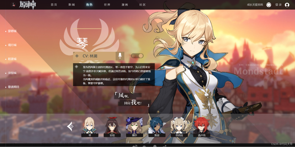
这个网页大量运用了flex布局,并且能够自适应屏幕宽度
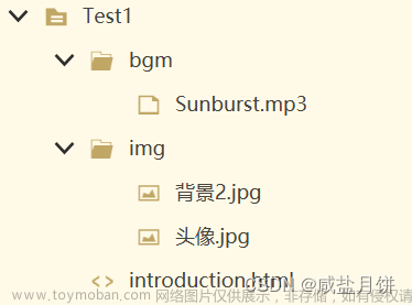
下面是HTML代码文章来源:https://www.toymoban.com/news/detail-540660.html
<!DOCTYPE html>
<html lang="zh-cn">

<head>
    <meta charset="UTF-8">
    <meta http-equiv="X-UA-Compatible" content="IE=edge">
    <meta name="viewport" content="width=device-width,minimum-scale=1.0,maximum-scale=1.0,user-scalable=0,initial-scale=1">
    <title>原神</title>
    <link rel="stylesheet" href="css/base.css">
    <link rel="stylesheet" href="css/index.css">
    <link rel="icon" href="images/10053.ico">
</head>

<body>
    <div class="social">
        <ul>
            <li ><a href="">
                <p>关注我们</p>
                <img src="images/微信.png" alt="">
                <p>扫码关注微信</p>
            </a></li>
            <li class="HEI"><a href=""> 官方微博</a></li>
            <li class="HEI"><a href=""> 官方微博</a></li>
            <li class="HEI"><a href=""> 官方微博</a></li>
        </ul>
    </div>
    <div class="nuxt">
        <div class="video-bg">
            <video src="video/《原神》官方网站-全新3.2版本 「虚空鼓动,劫火高扬」上线!.mp4" autoplay="autoplay" loop="loop"
                muted="nomuted"></video>
        </div>
        <div class="headers">
            <a href="index.html"></a>
            <ul>
                <li><a href="">首 页</a></li>
                <li><a href="">新 闻</a></li>
                <li><a href="">角 色</a></li>
                <li><a href="">世 界</a></li>
                <li><a href="">漫 画</a></li>
                <li><a href="">社 区</a></li>
            </ul>
            <div class="header-right">
                <a href="">成长关爱系统</a>
                <a href="">登录</a>
            </div>
        </div>
        <div class="poster-sign">
            <div class="positer-video"><button></button></div>
            <div class="download">
                <div class="box-download">
                    <div class="download-er"><img src="images/10053.ico" alt=""></div>
                    <div class="download-app">
                        <a href=""><img src="images/app.png" alt=""></a>
                        <a href=""><img src="images/app.png" alt=""></a>
                    </div>
                    <div class="download-tap">
                        <a href=""><img src="images/app.png" alt=""></a>
                        <a href=""><img src="images/app.png" alt=""></a>
                    </div>
                    <div class="download-pc">
                        <a href=""><img src="images/pc.png" alt=""></a>
                    </div>
                </div>
            </div>
            <div class="positer-arrows">
                <div class="arrow-1"></div>
                <div class="arrow-2"></div>
                <div class="arrow-3"></div>
            </div>
            <div class="positer-bages"><img src="images/12.png" alt=""></div>
        </div>
    </div>
    <section>
        <h1>新闻资讯</h1>
        <div class="auto">
            <div class="lunbotu">
                <div class="img">
                    <img src="images/11.jpg" alt="">
                    <img src="images/12.jpg" alt="">
                    <img src="images/13.jpg" alt="">
                    <img src="images/14.jpg" alt="">
                </div>
            </div>
            <div class="news">
                <ul class="title-tab">
                    <li>最新</li>
                    <li>新闻</li>
                    <li>公告</li>
                    <li>活动</li>
                </ul>
                <ul class="content-tab">
                    <li><a href="">得物3.2版本激励家化已开启</a>
                        <p>2022/11/02</p>
                    </li>
                    <li><a href="">《原神》官方网站-全新3即将开启</a>
                        <p>2022/11/02</p>
                    </li>
                    <li><a href="">《原神》耐心按:边界玄奥</a>
                        <p>2022/11/02</p>
                    </li>
                    <li><a href="">生日快乐|你来啦,正好</a>
                        <p>2022/11/02</p>
                    </li>
                    <li><a href="">《原神》官起源获得已开启</a>
                        <p>2022/11/02</p>
                    </li>
                </ul>
                <a href="">查看全部资讯</a>
            </div>
        </div>
    </section>
    <div class="city">
        <ul>
            <li>
                <div class="city-list-bg">

                </div>
                <a href="">
                    <p>
                        蒙德城
                    </p>
                </a>
                <div class="list-char"></div>
            </li>
            <li>
                <div class="city-list-bg">

                </div>
                <a href="">
                    <p>
                        璃月港
                    </p>
                </a>
                <div class="list-char"></div>

            </li>
            <li>
                <div class="city-list-bg">

                </div>
                <a href="">
                    <p>
                        稻妻城
                    </p>
                </a>
                <div class="list-char"></div>

            </li>
            <li>
                <div class="city-list-bg">

                </div>
                <a href="">
                    <p>
                        须弥城
                    </p>
                </a>
                <div class="list-char"></div>

            </li>
            <li>
                <a href="">
                    <div class="city-list-bg">

                    </div>
                    <p>经期期待</p>
                </a>
            </li>

        </ul>
    </div>
    <footer>
        <ul>
            <li></li>
            <li></li>
            <li></li>
            <li class="wrap-lap">
                <div class="share">
                    <p>分享志</p>
                    <ul class="wrap">
                        <li></li>
                        <li></li>
                        <li></li>
                        <li></li>
                    </ul>
                </div>
            </li>
        </ul>
        <div class="footer">
            <div class="footer-logo">
                <div>
                    <img src="images/logo2.png" alt="">
                    <span></span>
                    <img src="images/logo、.png" alt="">
                </div>
            </div>
            <div class="info">
                <div class="link">
                    <div>
                       <p>用户协议 | 隐私政策 | 儿童隐私政策| 自律公约| 家长监护工程 | 关于我们 | 联系我们| 加入我们</p>
                    </div>

                </div>
                <p>健康游戏忠告:抵制不良游戏,拒绝盗版游戏。注意自我保护,谨防受骗上当。适度游戏益脑,沉迷游戏伤身。合理安排时间,享受健康生活。</p>
                <p>沪公网安备31010402001113号
                    |
                    增值电信业务经营许可证:沪B2-20190555
                </p>
                <p>沪ICP备19018275号-4 | 沪网文〔2022〕1334-052号 | 国新出审【2019】2978号</p>
                <p>互联网违法不良信息举报邮箱: tousu@mihoyo.com 互联网违法不良信息举报电话: 021-60371750 (工作时间:每天10点 - 20点)</p>
                <p>亲爱的市民朋友,上海警方反诈劝阻电话“962110”系专门针对避免您财产被骗受损而设,请您一旦收到来电,立即接听</p>
                <p>未成年成长关爱热线:021-60371740 (服务时间:10:00-20:00)</p>
                <p>© 2020 米哈游版权所有 | 上海米哈游影铁科技有限公司 客服电话:400-666-6312</p>


            <div class="icon">
                <a href=""></a>
                <a href=""></a>
                <a href=""></a>
                <a href=""></a>
                <a href=""></a>
                <a href=""></a>

            </div>


        </div>
    </footer>
</body>

</html>下面是CSS样式文件文章来源地址https://www.toymoban.com/news/detail-540660.html
body {
  min-width: 1200px;
}
.nuxt {
  width: 100vw;
  height: 100vh;
  min-width: 1200px;
  display: flex;
  flex-direction: column;
  justify-content: space-between;
}
.nuxt .video-bg {
  position: absolute;
  top: 0;
  z-index: -1;
  height: 100vh;
  min-width: 800px;
  overflow: hidden;
  width: 100%;
}
.nuxt .video-bg video {
  min-width: 1000px;
  width: 100%;
  transform: translateY(-46px);
}
.nuxt .headers {
  background-color: rgba(0, 0, 0, 0.5);
  height: 66px;
  display: flex;
  align-items: center;
  justify-content: space-between;
  position: sticky;
  top: 0;
}
.nuxt .headers > a {
  display: flex;
  align-items: center;
  width: 317px;
  height: 66px;
  background: url(../images/logo.png);
  margin-left: 8px;
}
.nuxt .headers > a::before {
  content: '';
  display: inline-block;
  width: 30px;
  height: 30px;
  background: url(../images/音乐.png);
  background-size: 30px;
  margin-left: 61px;
  text-align: center;
}
.nuxt .headers ul {
  flex: 5;
  display: flex;
  height: 66px;
  align-items: center;
  margin-left: -40px;
}
.nuxt .headers ul li {
  height: 100%;
  text-align: center;
}
.nuxt .headers ul li a {
  position: relative;
  display: inline-block;
  line-height: 66px;
  height: 100%;
  text-align: center;
  margin: 0 30px;
  font-size: 17px;
  color: #ccc;
}
.nuxt .headers ul li a::before {
  content: '';
  position: absolute;
  width: 0;
  height: 5px;
  background-color: #69e0ff;
  transition: all 0.4s;
}
.nuxt .headers ul li a:hover {
  text-shadow: 0 0 10px #69e0ff, 0 0 20px #69e0ff, 0 0 40px #69e0ff;
  color: #fff;
}
.nuxt .headers ul li a:hover::before {
  display: block;
  width: 100%;
}
.nuxt .header-right {
  margin-right: 20px;
  display: flex;
  align-items: center;
}
.nuxt .header-right a {
  display: inline-block;
  color: #ccc;
  font-size: 17px;
  margin-right: 30px;
  margin-top: 2px;
}
.nuxt .header-right a::after {
  content: '';
  display: inline-block;
  width: 27px;
  height: 27px;
  background: url(../images/爱心.png);
  background-size: 27px;
  vertical-align: middle;
  margin-left: 15px;
}
.nuxt .poster-sign {
  flex: 0.3;
  width: 100%;
  height: 745px;
  display: flex;
  flex-direction: column;
  justify-content: center;
  align-items: center;
}
.nuxt .poster-sign .positer-video {
  background-color: pink;
  width: 356px;
  height: 76px;
  background: url(../images/播放-bg.png);
}
.nuxt .poster-sign .positer-video button {
  display: block;
  position: relative;
  margin: 14px auto 0;
  width: 48px;
  height: 48px;
  border-radius: 50%;
  border: 0px;
}
.nuxt .poster-sign .positer-video button:hover {
  background-color: transparent;
}
.nuxt .poster-sign .positer-video button:hover::before {
  background: url(../images/bofang.png) no-repeat 0px -28px;
}
.nuxt .poster-sign .positer-video button::before {
  content: '';
  display: block;
  position: absolute;
  left: 50%;
  top: 50%;
  z-index: 1;
  width: 28px;
  height: 28px;
  transform: translate(-50%, -50%);
  background: url(../images/bofang.png) no-repeat;
}
.nuxt .poster-sign .download {
  width: 540px;
  height: 125px;
  display: flex;
  align-items: center;
}
.nuxt .poster-sign .download .box-download {
  display: flex;
}
.nuxt .poster-sign .download .box-download .download-er {
  margin: 6px 0;
  position: relative;
  width: 102px;
  height: 102px;
  background: url(../images/二维码.png);
  background-size: 102px;
}
.nuxt .poster-sign .download .box-download .download-er img {
  width: 30px;
  height: 30px;
  position: absolute;
  top: 50%;
  left: 50%;
  margin-top: -15px;
  margin-left: -15px;
  border-radius: 3px;
}
.download-app {
  display: flex;
  flex-direction: column;
}
.download-tap {
  display: flex;
  flex-direction: column;
}
.box-download a img:hover {
  box-shadow: 1px 1px 20px 1px;
}
@keyframes arrow {
  50% {
    opacity: 0;
  }
}
div [class^=arrow-] {
  background: url(../images/xia.png) no-repeat;
  width: 25px;
  height: 15px;
  animation: arrow 1.5s infinite linear;
}
div .arrow-1 {
  animation-delay: 0.2s;
}
div .arrow-2 {
  animation-delay: 0.5s;
}
div .arrow-3 {
  animation-delay: 0.8s;
}
.positer-bages {
  position: absolute;
  left: 20px;
  bottom: 20px;
  width: 100px;
  height: 129px;
}
.positer-bages img {
  width: 100%;
  height: 100%;
}
@keyframes move {
  from {
    transform: translateX(0);
  }
  to {
    transform: translateX(-1920px);
  }
}
section {
  display: block;
  overflow: hidden;
  width: 100%;
  height: 910px;
  background: url(../images/bg2.jpg) no-repeat;
  background-size: 100% 100%;
}
section h1 {
  position: relative;
  margin: 183px auto 60px;
  font-size: 50px;
  width: 200px;
  color: #fff;
  font-weight: 400;
}
section h1::after {
  position: absolute;
  top: 30px;
  left: -354px;
  display: inline-block;
  content: '';
  width: 385px;
  height: 14px;
  background: url(../images/chang.png) no-repeat;
}
section h1::before {
  position: absolute;
  top: 30px;
  left: 163px;
  display: inline-block;
  content: '';
  width: 385px;
  height: 14px;
  transform: rotateY(180deg);
  background: url(../images/chang.png) no-repeat;
}
section .lunbotu {
  position: relative;
  width: 640px;
  height: 400px;
  overflow: hidden;
}
section .lunbotu .img {
  height: 402px;
  width: 2560px;
  animation: move 6s infinite steps(3);
}
section .lunbotu .img img {
  float: left;
  height: 100%;
}
section .news {
  position: relative;
  background-color: rgba(38, 18, 12, 0.62);
  width: 640px;
  height: 400px;
}
section .news > a {
  position: absolute;
  right: 33px;
  bottom: 30px;
  height: 22px;
  line-height: 22px;
  font-size: 18px;
  color: rgba(255, 255, 255, 0.75);
  cursor: pointer;
  padding-left: 38px;
  background: url(../images/十字.png) no-repeat left center / 22px;
}
section .news > a:hover {
  color: rgba(255, 212, 159, 0.75);
  background-image: url(../images/si.png);
}
section .title-tab {
  margin: 35px 24px 0;
  display: flex;
  overflow: hidden;
  box-sizing: border-box;
  width: 592px;
  height: 39px;
  transition: all 0.4s;
  border-bottom: 2px solid rgba(255, 255, 255, 0.08);
}
section .title-tab li {
  padding: 0 19px 12px;
  font-size: 18px;
  color: #fff;
  position: relative;
}
section .title-tab li:hover {
  color: #ffd49f;
  border-bottom: 2px solid #ffd49f;
}
section .content-tab {
  width: 592px;
  height: 260px;
  margin: 0 auto;
}
section .content-tab li {
  border-bottom: 2px solid rgba(255, 255, 255, 0.08);
  display: flex;
  justify-content: space-between;
  align-items: center;
  height: 52px;
  width: 592px;
}
section .content-tab li:hover {
  background-color: rgba(255, 255, 255, 0.08);
}
section .content-tab li a {
  display: inline-block;
  flex: 5;
  height: 52px;
  line-height: 52px;
  font-size: 16px;
  color: #fff;
  padding-left: 11px;
}
section .content-tab li p {
  display: inline-block;
  color: rgba(255, 255, 255, 0.35);
}
.auto {
  display: flex;
  justify-content: center;
}
.city ul {
  overflow: hidden;
}
.city ul li {
  transform-style: preserve-3d;
  position: relative;
  width: 100%;
  height: 260px;
  z-index: 10;
  background: center no-repeat;
  background-size: 100% auto;
  cursor: pointer;
  overflow: hidden;
}
.city ul li::before {
  position: absolute;
  content: '';
  display: inline-block;
  background-color: rgba(0, 0, 0, 0.5);
  width: 100%;
  height: 260px;
  z-index: 1;
}
.city ul li:hover::before {
  background-color: rgba(0, 0, 0, 0.2);
}
.city ul li:hover .city-list-bg {
  transform: scale(1.05);
  border: 10px solid #fff;
}
.city ul li:hover a p::before {
  display: block;
}
.city ul li .city-list-bg {
  width: 100vw;
  height: 100%;
  background: url(../images/蒙德城.jpg) no-repeat;
  background-size: 100% 100%;
  position: absolute;
  transition: transform 0.4s 0s ease-out;
  box-sizing: border-box;
  overflow: hidden;
}
.city ul li:hover .list-char {
  opacity: 1;
}
.city ul li .list-char {
  position: absolute;
  z-index: 6;
  top: 0;
  left: 0;
  display: block;
  content: '';
  width: 100%;
  height: 100%;
  background-repeat: no-repeat;
  background-position: calc(50% + 360px) 50%;
  background-size: 960px 260px;
  opacity: 0;
  transition: all 0.2s 0s ease-in;
  border: #fff solid 6px;
  box-sizing: border-box;
  background-image: url(../images/人物.png);
}
.city ul li a {
  display: block;
  height: 100%;
  position: relative;
  z-index: 3;
  width: 100%;
  height: 260px;
}
.city ul li a p {
  display: inline-block;
  position: relative;
  z-index: 3;
  font-size: 36px;
  color: #fff;
  line-height: 260px;
  width: 100%;
  height: 260px;
  background: url(../images/撑起.png) no-repeat center;
  background-size: 132px;
  text-align: center;
  text-shadow: 0 2px 6px rgba(0, 0, 0, 0.2);
  margin: 0 !important;
  overflow: hidden;
}
.city ul li a p::before {
  position: absolute;
  bottom: 91px;
  left: 50%;
  transform: translateX(-50%);
  display: none;
  content: '';
  width: 210px;
  height: 10px;
  background: url(../images/xia边.png) center no-repeat;
  background-size: 210px 10px;
}
.city ul li:nth-child(2) .city-list-bg {
  background: url(../images/bg22.jpg) no-repeat;
  background-size: 100% 100%;
}
.city ul li:nth-child(3) .city-list-bg {
  background: url(../images/办公3.jpg) no-repeat;
  background-size: 100% 100%;
}
.city ul li:nth-child(4) .city-list-bg {
  background: url(../images/bg44.jpg) no-repeat;
  background-size: 100% 100%;
}
.city ul li:nth-child(5) .city-list-bg {
  background: url(../images/hei.jpg) no-repeat;
  background-size: 100% 100%;
}
.city ul li:nth-child(2) .list-char {
  background-image: url(../images/人物2.png);
}
.city ul li:nth-child(3) .list-char {
  background-image: url(../images/人物3.png);
}
.city ul li:nth-child(4) .list-char {
  background-image: url(../images/人物4.png);
}
.city ul li:nth-child(5)::before {
  display: none;
}
.city ul li:nth-child(5) p::before {
  background-image: none;
}
footer {
  width: 100%;
  height: 430px;
  background-color: #ffd49f;
  padding: 0 0 35px;
}
footer .footer {
  width: 100%;
  height: 343px;
  padding: 30px 0 20px;
  background-color: #000;
  display: flex;
  justify-content: center;
  align-items: center;
}
footer .footer .footer-logo {
  width: 300px;
  height: 293px;
  display: flex;
  align-items: center;
}
footer .footer .footer-logo div {
  width: 280px;
  display: flex;
  justify-content: center;
  align-items: center;
}
footer .footer .footer-logo div img {
  width: 120px;
  height: 42px;
}
footer .footer .footer-logo div img:nth-of-type(2) {
  width: 110px;
  height: 80px;
}
footer .footer .footer-logo div span {
  background-color: #fff;
  width: 1px;
  height: 28px;
  margin: 0 25px;
}
footer .footer .info {
  width: 882px;
  height: 293px;
  margin-left: 60px;
}
footer .footer .info .icon {
  width: 800px;
  height: 76px;
  padding: 10px 0;
}
footer .footer .info .icon a {
  display: inline-block;
  width: 116px;
  height: 48px;
  background: url(../images/1.png) no-repeat;
}
footer .footer .info p {
  color: #999;
  height: 21px;
  font-size: 14px;
}
footer .footer .info .link {
  display: block;
  width: 882px;
  height: 52px;
  color: #fff;
  font-size: 14px;
  padding-bottom: 30px;
}
footer .footer .info .link div {
  width: 882px;
  height: 52px;
}
footer > ul {
  width: 100%;
  height: 52px;
  display: flex;
  justify-content: center;
  align-items: center;
  background-color: #111111;
}
footer > ul .wrap-lap {
  position: relative;
}
footer > ul .wrap-lap:hover .share {
  display: block;
}
footer > ul .wrap-lap .share {
  display: none;
  position: absolute;
  right: -6px;
  bottom: 0;
  width: 304px;
  height: 120px;
  border-radius: 6px;
  background: #3d3d3d;
  text-align: center;
  transform: translateY(142px);
  transform-origin: top;
}
footer > ul .wrap-lap .share P {
  height: 46px;
  line-height: 46px;
  color: #fff;
  font-size: 18px;
}
footer > ul .wrap-lap .share ul {
  width: 100%;
  height: 44px;
  display: flex;
  justify-content: center;
}
footer > ul .wrap-lap .share ul li {
  width: 44px;
  height: 44px;
  margin-right: 20px;
  background: url(../images/10049.png) no-repeat -7px -108px;
  background-size: 213px;
}
footer > ul .wrap-lap .share::before {
  position: absolute;
  top: -18px;
  right: 11px;
  width: 0;
  height: 0;
  display: block;
  border: 10px solid transparent;
  border-bottom: 10px solid #3d3d3d;
}
footer > ul > li {
  width: 32px;
  height: 32px;
  margin-right: 32px;
  cursor: pointer;
  background: url(../images/10049.png) no-repeat -7px -7px;
  background-size: 186px;
}
footer > ul > li:hover {
  background: url(../images/10049.png) no-repeat -54px -7px;
  background-size: 186px;
}
.social {
  position: fixed;
  right: 0px;
  top: 300px;
  background-color: #fff;
  width: 178px;
  height: 409px;
  z-index: 20;
}
.social ul {
  position: relative;
  display: flex;
  flex-direction: column;
  width: 178px;
  background: rgba(255, 255, 255, 0.9);
  padding: 0 2px 10px;
}
.social ul li {
  width: 174px;
  height: 44px;
}
.social ul li a::before {
  content: '\e626';
  margin-right: 20px;
  margin-left: 30px;
  font-family: 'iconfont';
  font-size: 30px;
  vertical-align: middle;
}
.social ul li:nth-child(1) {
  width: 174px;
  height: 267px;
}
.social ul li:nth-child(1) a {
  display: flex;
  flex-direction: column;
  align-items: center;
}
.social ul li:nth-child(1) a::before {
  content: '';
  width: 0;
  height: 0;
}
.social ul li:nth-child(1) a p:nth-child(1) {
  margin: 18px auto 27px;
  display: block;
  width: 72px;
  height: 24px;
}
.social ul li:nth-child(1) a img {
  text-align: center;
  width: 147px;
  height: 147px;
}
.HEI:hover {
  background-color: #000;
}
.HEI:hover a {
  color: #ffd49f;
}
到了这里,关于原神官网HTML+CSS的文章就介绍完了。如果您还想了解更多内容,请在右上角搜索TOY模板网以前的文章或继续浏览下面的相关文章,希望大家以后多多支持TOY模板网!