单帧布局FrameLayout
FrameLayout 又称单帧布局,是 Android 所提供的布局方式里最简单的布局方式,它指定屏幕上的一块空白区域,在该区域填充一个单一对象。例如图片、文字、按钮等。
应用程序开发人员不能为 FrameLayout 中填充的组件指定具体填充位置,默认情况下,这些组件都将被固定在屏幕的左上角,后放入的组件会放在前一个组件上进行覆盖填充,形成部分遮挡或全部遮挡。
开发人员可以通过组件的 android:layout_gravity 属性对组件位置进行适当的修改。
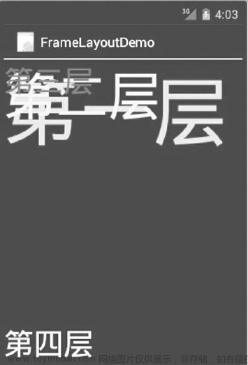
实例 FrameLayoutDemo 演示了 FrameLayout 的布局效果。该布局中共有 4 个 TextView 组件,前 3 个组件以默认方式放置到布局中,第 4 个组件修改 gravity 属性后放置到布局中,运行效果如下图所示。
实例 FrameLayoutDemo 中的布局文件 main.xml 的代码如下:
<?xml version="1.0" encoding="utf-8"?>
<FrameLayout xmlns:android="http://schemas.android.com/apk/res/android"
    android:layout_height="fill_parent"
    android:layout_width="fill_parent">

    <TextView
        android:id="@+id/text1"
        android:layout_width="wrap_content"
        android:layout_height="wrap_content"
        android:textColor="#00ff00"
        android:textsize="1OOdip"
        android:text="@string/first"/>
    <TextView
        android:id="@+id/text2"
        android:layout_width="wrap_content"
        android:layout_height="wrap_content"
        android:textColor="#00ffff"
        android:textsize="70dip"
        android:text="@string/second"/>
    <TextView
        android:id="@+id/text3"
        android:layout_width="wrap_content"
        android:layout_height="wrap_content"
        android:textColor="#ffOOOO"
        android:textsize="40dip"
        android:text="@string/third"/>
    <TextView
        android:id="@+id/text4"
        android:layout_width="wrap_content"
        android:layout_height="wrap_content"
        android:textColor="#fffffOO"
        android:textSize="40dip"
        android:layout_gravity="bottom"
        android:text="@string/forth"/>

</FrameLayout>
其中:
android:layout_width="wrap_content"
android:layout_height="wrap_content"
表明 FrameLayout 布局覆盖了整个屏幕空间。
实例 FrameLayoutDemo 中的 strings.xml 文件内容如下:
<?xml version="1.0" encoding="UTF-8" ?>
<resources>
    <string name="app_name">FrameLayoutDemo</string>
    <string name="first">第一层</string>
    <string name="second">第二层</string>
    <string name="third">第三层</string>
    <string name="forth">第四层</string>
</resources>
从运行后的结果可见,前 3 个被放置到 FrameLayout 的 TextView 组件都是以屏幕左上角为基点进行叠加的。第4个 TextView 因为设置了 android:layout_gravity=“bottom” 属性而显示到了布局的下方。可自行将 android:layout_gravity 属性值修改为其他属性,查看运行效果。帧布局
线性布局LinearLayout
前几个小节的例程中,XML文件用到了LinearLayout布局,它的学名为线性布局。顾名思义,线性布局 像是用一根线把它的内部视图串起来,故而内部视图之间的排列顺序是固定的,要么从左到右排列,要 么从上到下排列。在XML文件中,LinearLayout通过属性android:orientation区分两种方向,其中从左 到右排列叫作水平方向,属性值为horizontal;从上到下排列叫作垂直方向,属性值为vertical。如果LinearLayout标签不指定具体方向,则系统默认该布局为水平方向排列,也就是默认android:orientation="horizontal".
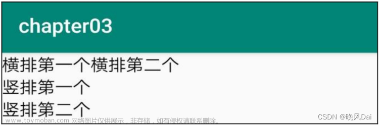
下面做个实验,让XML文件的根节点挂着两个线性布局,第一个线性布局采取horizontal水平方向,第 二个线性布局采取vertical垂直方向。然后每个线性布局内部各有两个文本视图,通过观察这些文本视图 的排列情况,从而检验线性布局的显示效果。详细的XML文件内容如下所示:
<LinearLayout xmlns:android="http://schemas.android.com/apk/res/android"

    android:layout_width="match_parent"

    android:layout_height="match_parent"

    android:orientation="vertical">

    <LinearLayout

        android:layout_width="match_parent"

        android:layout_height="wrap_content"

        android:orientation="horizontal">

        <TextView

            android:layout_width="wrap_content"
            android:layout_height="wrap_content"

            android:text="横排第一个"

            android:textSize="17sp"

            android:textColor="#000000" />

        <TextView

            android:layout_width="wrap_content"

            android:layout_height="wrap_content"

            android:text="横排第二个"

            android:textSize="17sp"

            android:textColor="#000000" />

    </LinearLayout>

    <LinearLayout

        android:layout_width="match_parent"

        android:layout_height="wrap_content"

        android:orientation="vertical">

        <TextView

            android:layout_width="wrap_content"

            android:layout_height="wrap_content"

            android:text="竖排第一个"

            android:textSize="17sp"

            android:textColor="#000000" />

        <TextView

            android:layout_width="wrap_content"

            android:layout_height="wrap_content"

            android:text="竖排第二个"

            android:textSize="17sp"

            android:textColor="#000000" />

    </LinearLayout>
</LinearLayout>
运行测试App,进入如下图所示的演示页面,可见horizontal为横向排列,vertical为纵向排列,说明android:orientation的方向属性确实奏效了。
除了方向之外,线性布局还有一个权重概念,所谓权重,指的是线性布局的下级视图各自拥有多大比例 的宽高。比如一块蛋糕分给两个人吃,可能两人平均分,也可能甲分三分之一,乙分三分之二。两人平 均分的话,先把蛋糕切两半,然后甲分到一半,乙分到另一半,此时甲乙的权重比为1:1。甲分三分之 一、乙分三分之二的话,先把蛋糕平均切成三块,然后甲分到一块,乙分到两块,此时甲乙的权重比为1:2。就线性布局而言,它自身的尺寸相当于一整块蛋糕,它的下级视图们一起来分这个尺寸蛋糕,有的 视图分得多,有的视图分得少。分多分少全凭每个视图分到了多大的权重,这个权重在XML文件中通过 属性android:layout_weight来表达。
把线性布局看作蛋糕的话,分蛋糕的甲乙两人就相当于线性布局的下级视图。假设线性布局平均分为左 右两块,则甲视图和乙视图的权重比为1:1,意味着两个下级视图的layout_weight属性都是1。不过视图 有宽高两个方向,系统怎知layout_weight表示哪个方向的权重呢?所以这里有个规定,一旦设置了layout_weight属性值,便要求layout_width填0dp或者layout_height填0dp。如果layout_width填0dp,则layout_weight表示水平方向的权重,下级视图会从左往右分割线性布局;如果layout_height填0dp,则layout_weight表示垂直方向的权重,下级视图会从上往下分割线性布局。 按照左右均分的话,线性布局设置水平方向horizontal,且甲乙两视图的layout_width都填0dp,layout_weight都填1,此时横排的XML片段示例如下:
<LinearLayout

        android:layout_width="match_parent"

        android:layout_height="wrap_content"

        android:orientation="horizontal">

    <TextView

              android:layout_width="0dp"

              android:layout_height="wrap_content"

              android:layout_weight="1"

              android:text="横排第一个"

              android:textSize="17sp"

              android:textColor="#000000" />

    <TextView

              android:layout_width="0dp"

              android:layout_height="wrap_content"

              android:layout_weight="1"

              android:text="横排第二个"

              android:textSize="17sp"

              android:textColor="#000000" />
</LinearLayout>
按照上下均分的话,线性布局设置垂直方向vertical,且甲乙两视图的layout_height都填0dp,layout_weight都填1,此时竖排的XML片段示例如下:
<LinearLayout

        android:layout_width="match_parent"

        android:layout_height="wrap_content"

        android:orientation="vertical">

    <TextView

              android:layout_width="wrap_content"

              android:layout_height="0dp"

              android:layout_weight="1"

              android:text="竖排第一个"

              android:textSize="17sp"

              android:textColor="#000000" />

    <TextView

              android:layout_width="wrap_content"

              android:layout_height="0dp"

              android:layout_weight="1"

              android:text="竖排第二个"

              android:textSize="17sp"

              android:textColor="#000000" />
</LinearLayout>
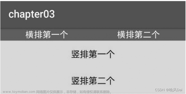
把上面两个片段放到新页面的XML文件,其中第一个是横排区域采用红色背景(色值为ff0000),第二 个是竖排区域采用青色背景(色值为00ffff)。重新运行测试App,打开演示界面如下图所示,可见横 排区域平均分为左右两块,竖排区域平均分为上下两块。
相对布局RelativeLayout
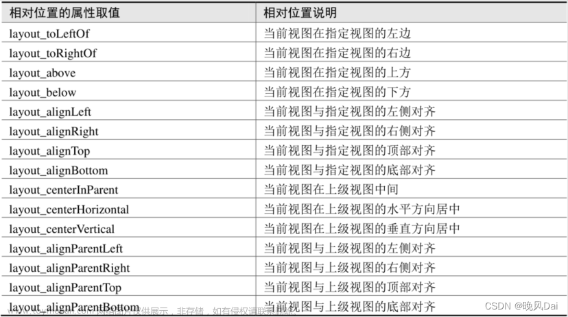
线性布局的下级视图是顺序排列着的,另一种相对布局的下级视图位置则由其他视图决定。相对布局名 为RelativeLayout,因为下级视图的位置是相对位置,所以得有具体的参照物才能确定最终位置。如果不设定下级视图的参照物,那么下级视图默认显示在RelativeLayout内部的左上角。 用于确定下级视图位置的参照物分两种,一种是与该视图自身平级的视图;另一种是该视图的上级视图 (也就是它归属的RelativeLayout)。综合两种参照物,相对位置在XML文件中的属性名称说明见下表。
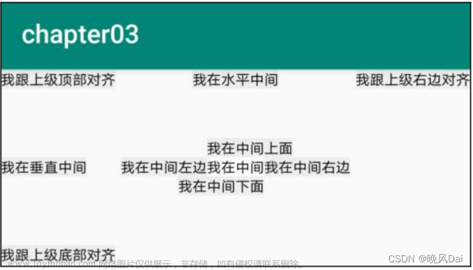
为了更好地理解上述相对属性的含义,接下来使用RelativeLayout及其下级视图进行布局来看看实际效果图。下面是演示相对布局的XML文件例子:
<RelativeLayout xmlns:android="http://schemas.android.com/apk/res/android"

    android:layout_width="match_parent"

    android:layout_height="150dp" >

        <TextView

        android:id="@+id/tv_center"

        android:layout_width="wrap_content"

        android:layout_height="wrap_content"

        android:layout_centerInParent="true"

        android:background="#ffffff"

        android:text="我在中间"

        android:textSize="11sp"

        android:textColor="#000000" />


    <TextView

        android:id="@+id/tv_center_horizontal"

        android:layout_width="wrap_content"

        android:layout_height="wrap_content"

        android:layout_centerHorizontal="true"

        android:background="#eeeeee"

        android:text="我在水平中间"

        android:textSize="11sp"

        android:textColor="#000000" />


    <TextView

        android:id="@+id/tv_center_vertical"

        android:layout_width="wrap_content"

        android:layout_height="wrap_content"

        android:layout_centerVertical="true"

        android:background="#eeeeee"

        android:text="我在垂直中间"

        android:textSize="11sp"

        android:textColor="#000000" />


    <TextView

        android:id="@+id/tv_parent_left"

        android:layout_width="wrap_content"

        android:layout_height="wrap_content"

        android:layout_alignParentLeft="true"

        android:background="#eeeeee"

        android:text="我跟上级左边对齐"

        android:textSize="11sp"

        android:textColor="#000000" />

    <TextView

        android:id="@+id/tv_parent_right"

        android:layout_width="wrap_content"

        android:layout_height="wrap_content"

        android:layout_alignParentRight="true"

        android:background="#eeeeee"

        android:text="我跟上级右边对齐"

        android:textSize="11sp"

        android:textColor="#000000" />

    <TextView

        android:id="@+id/tv_parent_top"

        android:layout_width="wrap_content"

        android:layout_height="wrap_content"

        android:layout_alignParentTop="true"

        android:background="#eeeeee"

        android:text="我跟上级顶部对齐"

        android:textSize="11sp"
        android:textColor="#000000" />

    <TextView

        android:id="@+id/tv_parent_bottom"

        android:layout_width="wrap_content"

        android:layout_height="wrap_content"

        android:layout_alignParentBottom="true"

        android:background="#eeeeee"

        android:text="我跟上级底部对齐"

        android:textSize="11sp"

        android:textColor="#000000" />


    <TextView

        android:id="@+id/tv_left_center"

        android:layout_width="wrap_content"

        android:layout_height="wrap_content"

        android:layout_toLeftOf="@+id/tv_center"

        android:layout_alignTop="@+id/tv_center"

        android:background="#eeeeee"

        android:text="我在中间左边"

        android:textSize="11sp"

        android:textColor="#000000" />


    <TextView

        android:id="@+id/tv_right_center"

        android:layout_width="wrap_content"

        android:layout_height="wrap_content"

        android:layout_toRightOf="@+id/tv_center"

        android:layout_alignBottom="@+id/tv_center"

        android:background="#eeeeee"

        android:text="我在中间右边"

        android:textSize="11sp"

        android:textColor="#000000" />


    <TextView

        android:id="@+id/tv_above_center"

        android:layout_width="wrap_content"

        android:layout_height="wrap_content"

        android:layout_above="@+id/tv_center"

        android:layout_alignLeft="@+id/tv_center"

        android:background="#eeeeee"

        android:text="我在中间上面"

        android:textSize="11sp"

        android:textColor="#000000" />


    <TextView

        android:id="@+id/tv_below_center"

        android:layout_width="wrap_content"

        android:layout_height="wrap_content"

        android:layout_below="@+id/tv_center"

        android:layout_alignRight="@+id/tv_center"

        android:background="#eeeeee"

        android:text="我在中间下面"

        android:textSize="11sp"

        android:textColor="#000000" />
</RelativeLayout>
上述XML文件的布局效果如下图所示,RelativeLayout的下级视图都是文本视图,控件上的文字说明 了所处的相对位置,具体的控件显示方位正如XML属性中描述的那样。
Java程序如下:
package com.example.chapter03;
import androidx.appcompat.app.AppCompatActivity;
import android.os.Bundle;

public class RelativeLayoutActivity extends AppCompatActivity {
    @Override
    protected void onCreate(Bundle savedInstanceState) {
        super.onCreate(savedInstanceState);
        setContentView(R.layout.activity_relative_layout);
    }
}
布局参数
内边距
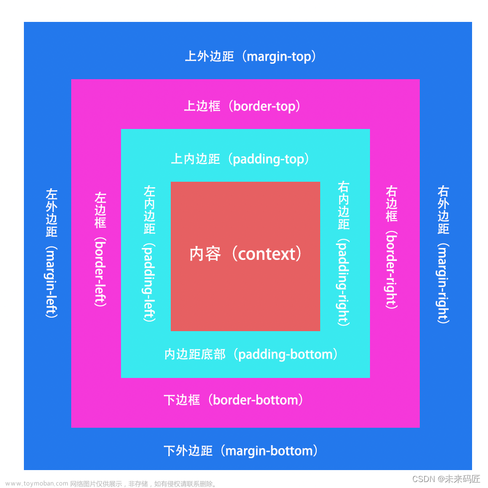
内边距(padding)是视图或元素边界内的空间。它是视图边缘和视图内容之间的空间。
属性
android:padding为所有四个边框和内容之间的空间。
android:paddingTop为上边框和上内容之间的空间。
android:paddingBottom为下边框和下内容之间的空间。
android:paddingStart 为最左边框和最左内容之间的空间。
android:paddingEnd为最右边框和最右内容之间的空间。
android:paddingLeft为左边框和左内容之间的空间。
android:paddingRight为右边框和右内容之间的空间。
定位
根据父容器定位:
layout_alignParentLeft :左对齐
layout_alignParentRight :右对齐
layout_alignParentTop :顶部对齐
layout_alignParentBottom :底部对齐
layout_centerHorizontal :水平居中
layout_centerVertical :垂直居中
layout_centerlnParent :中间位置根据兄弟组件定位
根据兄弟组件定位:
此设置需要与兄弟组件的id绑定
layout_toLeftOf :放置于参考组件的左边
layout_toRightOf :放置于参考组件的右边
layout_above :放置于参考组件的上方
layout_below :放置于参考组件的下方
layout_alignTop :对齐参考组件的上边界
layout_alignBottom :对齐参考组件的下边界
layout_alignLeft :对齐参考组件的左边界
layout_alignRight :对齐参考组件的右边界
通用属性文章来源:https://www.toymoban.com/news/detail-647266.html
margin 设置组件与父容器的边距
layout_margin 上下左右偏移
layout_marginLeft
layout_marginRight
layout_marginTop
layout_margiBottom
padding设置组件内部元素的边距这是设置自己内部的
m为设置自己外部文章来源地址https://www.toymoban.com/news/detail-647266.html
到了这里,关于Android学习之路(3) 布局的文章就介绍完了。如果您还想了解更多内容,请在右上角搜索TOY模板网以前的文章或继续浏览下面的相关文章,希望大家以后多多支持TOY模板网!